Introduction
Inspired by Jonas K. Lindeløv’s excellent website
this post will walk through common statistical tests used when analyzing categorical variables in R.
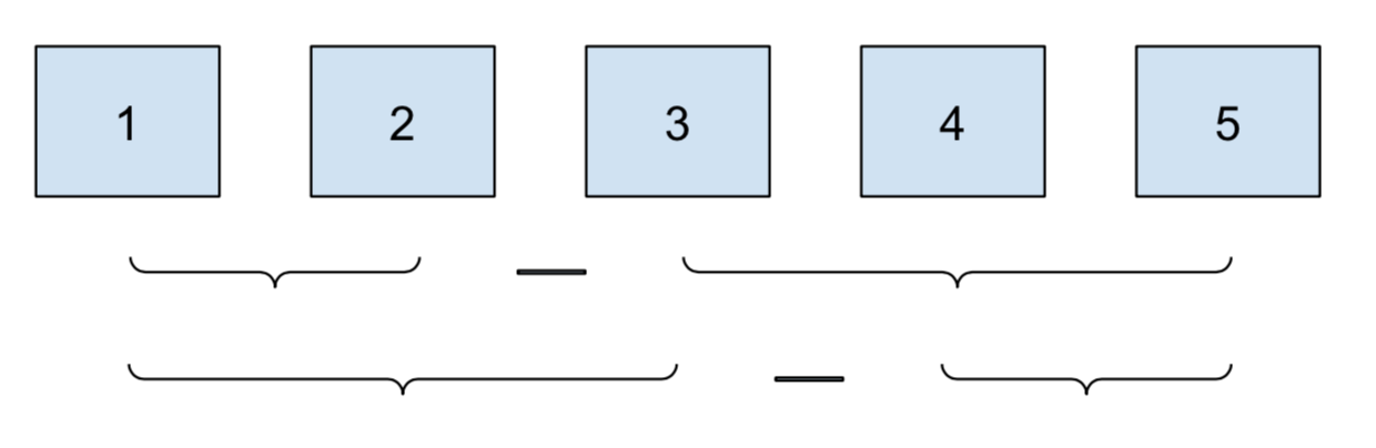
I’ll cover 5 situations:
- pairwise differences between members of a category
- comparison to the overall category mean
- pairwise differences within a category
- consecutive comparisons of time-based or sequential factors
- before-and-after comparisons
How to use contrasts in R
In short: don’t bother.1
Like many before me, one of my stats classes technically “taught” me contrasts. But I didn’t get the point and using them was cumbersome, so I promptly ignored them for years.
Luckily for me, someone came along and fixed the situation:
emmeans.
emmeans frames contrasts as a question you pose to a model:
you can ask for all pairwise comparisons and get back that.
lm and summary treat the same problem as fitting abstract
coefficients, and you are left to answer your own question.
emmeans works with lm, glm,
and the Bayesian friends in
brms and
rstanarm,
so the process is applicable no matter the tool.
And you don’t have to learn (much) about contrasts to take advantage of it.
Cheatsheet
This article is summarized in the following table. For more information on
emmeans and contrasts, be sure to visit the extensive emmeans
vignettes.
Template:
lm(outcome ~ cat, data = df) %>%
emmeans(pairwise ~ cat)| test | emmeans formula | diagram |
|---|---|---|
| pairwise | pairwise ~ cat |
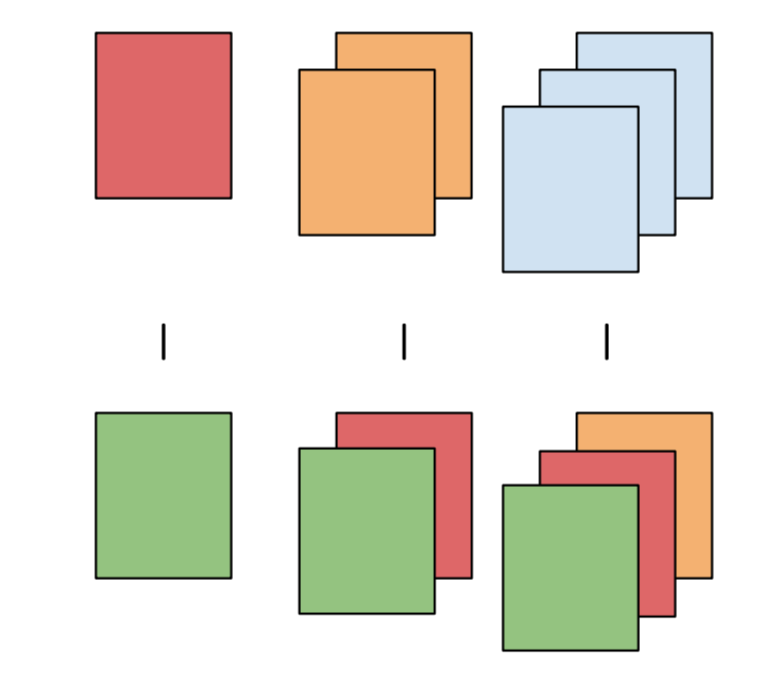 |
| mean | [eff | del.eff] ~ cat |
 |
| pairwise in category | pairwise ~ cat_cmp | cat_within |
 |
| consecutive | consec ~ cat |
 |
| before and after | mean_chg ~ cat |
 |
Pairwise differences
The goal of this section is to look at pairwise differences between values of a category. The primary example will be pairwise differences in air time between airlines.
We’ll start the analysis by grabbing 100 random flights from the top 5 airlines,
using data from the nycflights13 package.
library(tidyverse, warn.conflicts = TRUE)
library(emmeans)
library(broom)
library(nycflights13)

set.seed(158)

flights <- nycflights13::flights %>%
  left_join(nycflights13::airlines)

top_carriers <- flights %>%
  count(name) %>%
  slice_max(n, n = 5)

flights <- flights %>%
  filter(name %in% top_carriers$name) %>%
  mutate(across(c(name, month), as.factor)) %>%
  mutate(across(name, str_replace, " Inc.", "")) %>%
  mutate(time_of_day = case_when(
    between(sched_dep_time, 0, 1159) ~ "am",
    TRUE ~ "pm"
  )) %>%
  group_by(name) %>%
  slice_sample(n = 100) %>%
  ungroup()
For each airline, we can we find the mean air time. But we also want to test if the airlines differ significantly.
flights %>%
  group_by(name) %>%
  summarise(across(air_time, mean, na.rm = TRUE), n = n())
## # A tibble: 5 x 3
## name air_time n
## <chr> <dbl> <int>
## 1 American Airlines 183. 100
## 2 Delta Air Lines 169. 100
## 3 ExpressJet Airlines 98.4 100
## 4 JetBlue Airways 167. 100
## 5 United Air Lines 206. 100To figure this out, we’ll fit a linear model using the airlines as predictors.
lm_airlines <- lm(air_time ~ name, data = flights)
summary(lm_airlines)
##
## Call:
## lm(formula = air_time ~ name, data = flights)
##
## Residuals:
## Min 1Q Median 3Q Max
## -170.36 -51.17 -15.44 33.35 434.64
##
## Coefficients:
## Estimate Std. Error t value Pr(>|t|)
## (Intercept) 183.093 8.371 21.873 < 2e-16 ***
## nameDelta Air Lines -13.941 11.778 -1.184 0.2371
## nameExpressJet Airlines -84.680 11.838 -7.153 3.13e-12 ***
## nameJetBlue Airways -16.366 11.778 -1.390 0.1653
## nameUnited Air Lines 23.267 11.749 1.980 0.0482 *
## ---
## Signif. codes: 0 '***' 0.001 '**' 0.01 '*' 0.05 '.' 0.1 ' ' 1
##
## Residual standard error: 82.44 on 487 degrees of freedom
## (8 observations deleted due to missingness)
## Multiple R-squared: 0.1609, Adjusted R-squared: 0.1541
## F-statistic: 23.35 on 4 and 487 DF, p-value: < 2.2e-16The classic lm-to-summary workflow.
Notice that American Airlines is no-where to be found.
That’s because it’s the “default” category.
R calls this contrast treatment but the more common name is dummy encoding.
All the other name[Airline] rows in the table show the estimated change
in air time from American Airlines, and how confident the model is
on that change based on the p-value.
This tells us some nice stuff. ExpressJet Airlines has much lower air time than American, while United has a little more. But that’s it.
We can’t answer our questions about pairwise differences:
- Are Delta and JetBlue really that different?
- How do our two top airlines compare?
- What about the bottom two?
To find all these pairwise differences, we need emmeans::emmeans:
lm_airlines %>%
  emmeans(pairwise ~ name)
## $emmeans
## name emmean SE df lower.CL upper.CL
## American Airlines 183.1 8.37 487 167 200
## Delta Air Lines 169.2 8.29 487 153 185
## ExpressJet Airlines 98.4 8.37 487 82 115
## JetBlue Airways 166.7 8.29 487 150 183
## United Air Lines 206.4 8.24 487 190 223
##
## Confidence level used: 0.95
##
## $contrasts
## contrast estimate SE df t.ratio p.value
## American Airlines - Delta Air Lines 13.94 11.8 487 1.184 0.7608
## American Airlines - ExpressJet Airlines 84.68 11.8 487 7.153 <.0001
## American Airlines - JetBlue Airways 16.37 11.8 487 1.390 0.6347
## American Airlines - United Air Lines -23.27 11.7 487 -1.980 0.2771
## Delta Air Lines - ExpressJet Airlines 70.74 11.8 487 6.006 <.0001
## Delta Air Lines - JetBlue Airways 2.42 11.7 487 0.207 0.9996
## Delta Air Lines - United Air Lines -37.21 11.7 487 -3.183 0.0134
## ExpressJet Airlines - JetBlue Airways -68.31 11.8 487 -5.800 <.0001
## ExpressJet Airlines - United Air Lines -107.95 11.7 487 -9.188 <.0001
## JetBlue Airways - United Air Lines -39.63 11.7 487 -3.391 0.0067
##
## P value adjustment: tukey method for comparing a family of 5 estimatesemmeans explicitly returns the estimated differences and p-values
for every combination of airlines.
We notice that the difference between the middle two airlines Delta and JetBlue is not significant. American has about 23 minutes less air time than United, but it’s not significant either. And not surprisingly, any difference over 35 minutes seems significant.
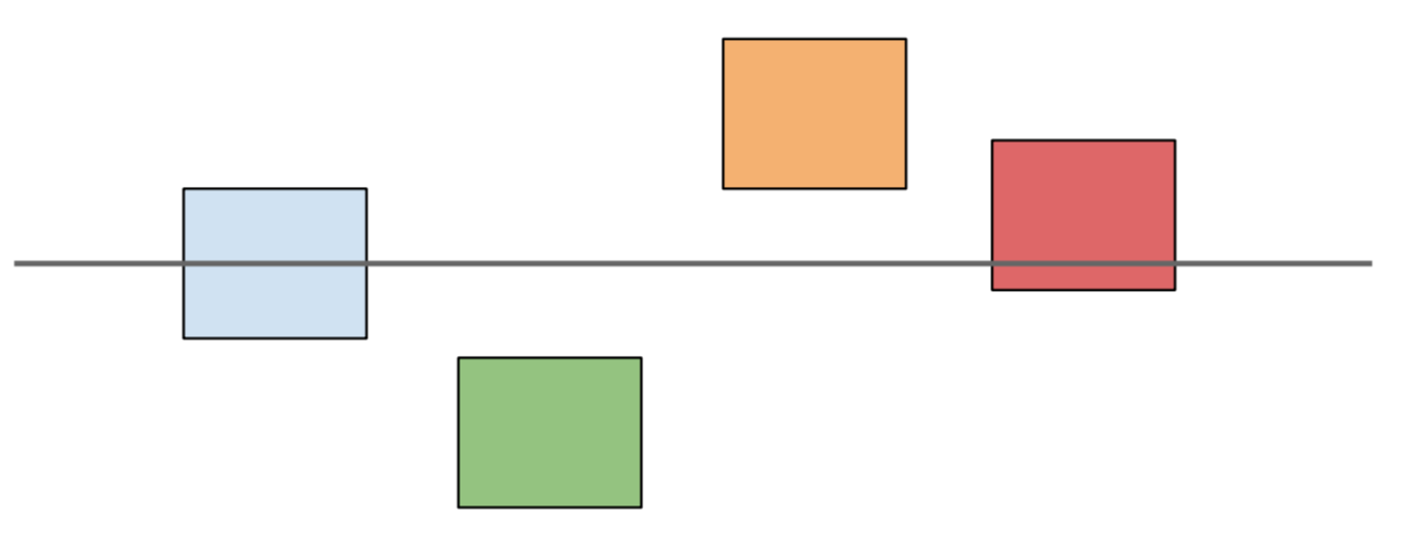
Comparison to overall mean
We might also be interested in comparing each airline not to each other, but to the overall mean. This is useful for benchmarking the companies based on which ones are above and below the overall average.
lm_airlines %>%
  emmeans(eff ~ name) %>%
  pluck("contrasts")
## contrast estimate SE df t.ratio p.value
## American Airlines effect 18.34 7.47 487 2.454 0.0241
## Delta Air Lines effect 4.40 7.42 487 0.594 0.6913
## ExpressJet Airlines effect -66.34 7.47 487 -8.876 <.0001
## JetBlue Airways effect 1.98 7.42 487 0.267 0.7898
## United Air Lines effect 41.61 7.39 487 5.632 <.0001
##
## P value adjustment: fdr method for 5 testsUsing average air time across airlines as a benchmark for comparison, Delta and JetBlue fall right in the middle. United and Delta lead, with ExpressJet trailing far behind.
We can also see how one company compares against all the others by using
the del.eff contrast:
lm_airlines %>%
  emmeans(del.eff ~ name) %>%
  pluck("contrasts")
## contrast estimate SE df t.ratio p.value
## American Airlines effect 22.93 9.34 487 2.454 0.0241
## Delta Air Lines effect 5.50 9.27 487 0.594 0.6913
## ExpressJet Airlines effect -82.92 9.34 487 -8.876 <.0001
## JetBlue Airways effect 2.47 9.27 487 0.267 0.7898
## United Air Lines effect 52.01 9.24 487 5.632 <.0001
##
## P value adjustment: fdr method for 5 testsPairwise comparisons within groups
It’s common to check pairwise comparisons within groups. For example, you might want to see if students who attended an ACT prep class scored higher on the test than those who didn’t. If students from multiple schools were eligible to take the prep class, you’d want to test the effect of the class within schools, to control for variation.
Going back to air travel, it’s pretty clear that flights are delayed longer for departure in the PM than in the AM.
lm(dep_delay ~ time_of_day, data = flights) %>%
  tidy()
## # A tibble: 2 x 5
## term estimate std.error statistic p.value
## <chr> <dbl> <dbl> <dbl> <dbl>
## 1 (Intercept) 1.16 2.59 0.449 0.654
## 2 time_of_daypm 17.8 3.27 5.43 0.0000000871On average, flights in the PM are delayed 17 minutes longer than flights leaving in the AM. And this difference is very significant.
But is this effect consistent across airlines? Are some airlines performing better than others, or is there one bad airline causing most of this delay?
The normal summary on linear regression doesn’t answer these questions:
lm_delay <- lm(dep_delay ~ name * time_of_day, data = flights)
tidy(lm_delay)
## # A tibble: 10 x 5
## term estimate std.error statistic p.value
## <chr> <dbl> <dbl> <dbl> <dbl>
## 1 (Intercept) -0.414 6.52 -0.0635 0.949
## 2 nameDelta Air Lines -0.443 8.47 -0.0523 0.958
## 3 nameExpressJet Airlines 4.78 8.51 0.561 0.575
## 4 nameJetBlue Airways 2.19 8.56 0.256 0.798
## 5 nameUnited Air Lines 0.789 9.00 0.0877 0.930
## 6 time_of_daypm 12.3 7.76 1.59 0.113
## 7 nameDelta Air Lines:time_of_daypm 8.21 10.5 0.779 0.436
## 8 nameExpressJet Airlines:time_of_daypm 13.4 10.6 1.27 0.206
## 9 nameJetBlue Airways:time_of_daypm 4.78 10.6 0.452 0.652
## 10 nameUnited Air Lines:time_of_daypm 3.59 10.8 0.332 0.740If we just looked at the p-values uncritically,
we might conclude that there are no significant differences
between AM and PM delays across the airlines,
since the smallest p-value is around 0.1.
But remember that by default lm is only computing the time difference
(the interactions) relative to American Airlines.
We don’t care if the airlines differ from American: we care how they compare to themselves in the morning and the evening.
Therefore, we need to do a pairwise comparison of AM and PM within each group:
lm_delay %>%
  emmeans(pairwise ~ time_of_day | name) %>%
  pluck("contrasts")
## name = American Airlines:
## contrast estimate SE df t.ratio p.value
## am - pm -12.3 7.76 483 -1.588 0.1131
##
## name = Delta Air Lines:
## contrast estimate SE df t.ratio p.value
## am - pm -20.5 7.14 483 -2.879 0.0042
##
## name = ExpressJet Airlines:
## contrast estimate SE df t.ratio p.value
## am - pm -25.8 7.21 483 -3.572 0.0004
##
## name = JetBlue Airways:
## contrast estimate SE df t.ratio p.value
## am - pm -17.1 7.19 483 -2.380 0.0177
##
## name = United Air Lines:
## contrast estimate SE df t.ratio p.value
## am - pm -15.9 7.52 483 -2.116 0.0348Compared to lm, emmeans tell a completely different story.
We are confident that every airline, save American, has more delays in the PM.
It’s also more clear why the default contrast in lm gave such a
different outlook. The magnitude of the differences between airlines
don’t different all that much, ranging from -12 to -25.
Those differences aren’t significant when compared to American,
but the differences from morning to night certainly are.
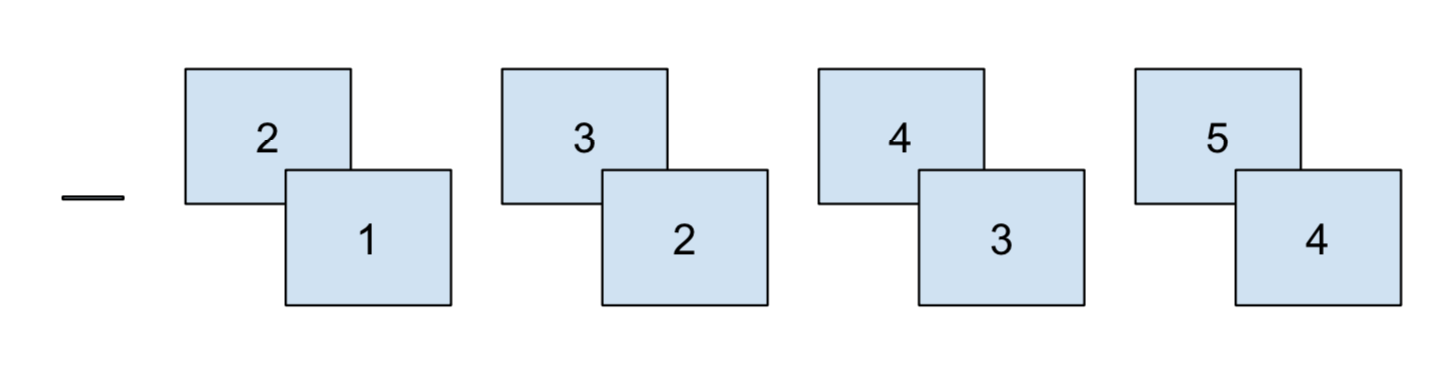
Consecutive comparisons
Consecutive comparisons frequently occur with yearly aggregations. It’s natural to ask how 2020 compares to 2019, and how 2019 compared to 2018. Changes from year-to-year might be an effect of random variation, or the company might want to measure the impact of a new release or strategy.
In my line of work, this is particularly important for usability testing. For example, do users who started in 2018 find it easier to navigate a website, compared to newer users who started in 2019?
In this section, we’ll show how to do consecutive comparisons, using airplane data as an example.
planes <- nycflights13::planes %>%
  filter(year > 2003) %>%
  mutate(across(year, as.factor))
Let’s analyze the average number of airplane seats per year. More seats are great for airlines, because they can sell more tickets, but travelers don’t like being crammed and uncomfortable.
planes %>%
  group_by(year) %>%
  summarise(across(seats, mean, na.rm = TRUE), n = n()) %>%
  arrange(desc(year))
## # A tibble: 10 x 3
## year seats n
## <fct> <dbl> <int>
## 1 2013 192. 92
## 2 2012 199. 95
## 3 2011 197. 66
## 4 2010 152. 48
## 5 2009 182. 84
## 6 2008 136. 147
## 7 2007 121. 123
## 8 2006 127. 126
## 9 2005 113. 162
## 10 2004 116. 192It’s pretty clear that this is a increasing year-over-year trend, as a linear regression confirms:
lm(seats ~ as.numeric(year), data = planes) %>%
  tidy()
## # A tibble: 2 x 5
## term estimate std.error statistic p.value
## <chr> <dbl> <dbl> <dbl> <dbl>
## 1 (Intercept) 95.7 4.12 23.2 7.24e-98
## 2 as.numeric(year) 10.4 0.752 13.9 1.96e-40But 2013, 2012, and 2011 look really similar. Let’s see how significant those differences are by doing consecutive comparisons:
lm_seats <- lm(seats ~ year, data = planes)

lm_seats %>%
  emmeans(consec ~ year) %>%
  pluck("contrasts")
## contrast estimate SE df t.ratio p.value
## 2005 - 2004 -3.48 7.82 1125 -0.445 0.9997
## 2006 - 2005 14.34 8.70 1125 1.648 0.5509
## 2007 - 2006 -5.65 9.29 1125 -0.608 0.9972
## 2008 - 2007 14.29 8.95 1125 1.596 0.5903
## 2009 - 2008 46.18 10.02 1125 4.609 <.0001
## 2010 - 2009 -29.39 13.25 1125 -2.217 0.1957
## 2011 - 2010 44.23 13.90 1125 3.183 0.0129
## 2012 - 2011 1.98 11.74 1125 0.169 1.0000
## 2013 - 2012 -6.69 10.72 1125 -0.624 0.9966
##
## P value adjustment: mvt method for 9 testsConsecutive comparisons highlight the years where there were significant peaks in the average number of airplanes seats: 2009 and 2011.
And like we thought, there is little change from 2011 to 2013.
Before and after
The last type of contrast we’ll talk about today is before and after mean comparisons. It’s similar to consecutive comparisons, because it often only makes sense for sequential factors like time.
This one’s also unique, because the unit of comparison is not necessarily an individual member of a category, but rather groups compared to other groups.
Continuing with seats from the previous section, an exampe of a before and after comparison would be comparing the mean number of seats from 2003 - 2008 to the mean number of seats from 2009 - 2013.
This type of analysis is useful for non-linear trends, where you want to identity the change point (hence the name before and after).
Returning to delays, how much variation is there month-to-month?
As always, we’ll run the tests using linear regression:
lm_month <- lm(dep_delay ~ month, data = flights)
tidy(lm_month)
## # A tibble: 12 x 5
## term estimate std.error statistic p.value
## <chr> <dbl> <dbl> <dbl> <dbl>
## 1 (Intercept) 10.5 5.41 1.95 0.0520
## 2 month2 -2.96 7.90 -0.374 0.708
## 3 month3 6.32 7.79 0.810 0.418
## 4 month4 10.3 7.45 1.39 0.166
## 5 month5 8.39 7.79 1.08 0.282
## 6 month6 7.51 7.65 0.982 0.327
## 7 month7 20.3 7.74 2.62 0.00904
## 8 month8 -5.44 7.74 -0.702 0.483
## 9 month9 -10.9 7.45 -1.46 0.145
## 10 month10 -3.08 7.79 -0.396 0.692
## 11 month11 -2.90 7.90 -0.368 0.713
## 12 month12 -8.35 8.21 -1.02 0.309The default contrast tells us that month 7, July, has significantly longer delays than January. But how does this average change over the course of the year?
lm_month %>%
  emmeans(mean_chg ~ month)
## $emmeans
## month emmean SE df lower.CL upper.CL
## 1 10.535 5.41 481 -0.0936 21.16
## 2 7.579 5.75 481 -3.7272 18.89
## 3 16.850 5.61 481 5.8301 27.87
## 4 20.875 5.12 481 10.8153 30.93
## 5 18.925 5.61 481 7.9051 29.94
## 6 18.047 5.41 481 7.4180 28.68
## 7 30.829 5.54 481 19.9446 41.71
## 8 5.098 5.54 481 -5.7871 15.98
## 9 -0.333 5.12 481 -10.3931 9.73
## 10 7.450 5.61 481 -3.5699 18.47
## 11 7.632 5.75 481 -3.6746 18.94
## 12 2.182 6.17 481 -9.9507 14.31
##
## Confidence level used: 0.95
##
## $contrasts
## contrast estimate SE df t.ratio p.value
## 1|2 1.750 5.66 481 0.309 1.0000
## 2|3 3.698 4.32 481 0.856 0.9499
## 3|4 0.646 3.72 481 0.174 1.0000
## 4|5 -2.731 3.38 481 -0.808 0.9633
## 5|6 -4.824 3.25 481 -1.486 0.5733
## 6|7 -6.659 3.21 481 -2.074 0.2173
## 7|8 -13.257 3.27 481 -4.053 0.0005
## 8|9 -11.860 3.44 481 -3.447 0.0051
## 9|10 -8.513 3.84 481 -2.219 0.1607
## 10|11 -8.679 4.56 481 -1.903 0.3009
## 11|12 -10.862 6.39 481 -1.699 0.4237
##
## P value adjustment: mvt method for 11 testsAs I mentioned before, this one is a little more complicated to understand. Each row measures the difference using
after_average - before_average
So row 7 | 8, the first significant row, says that
the average delay from August to December is 11 minutes lower than
the average delay from January to August.
This indicates that August turning point in the year (the before and after moment), when delays start to shrink.
If you are really curious, you might find these posts about contrasts in R useful:
1. http://www.clayford.net/statistics/tag/sum-contrasts/
2. https://www.r-bloggers.com/using-and-interpreting-different-contrasts-in-linear-models-in-r/
3. https://blogs.uoregon.edu/rclub/2015/11/03/anova-contrasts-in-r/
↩︎